Saturday, May 7, 2011

Illusion of Motion by Multiple Images


This piece gives the illusion of motion because the slight changes in each successive position of the man as we walked down the stairs suggests movement taking place.

Illusion of Motion by Blurred Outline


In this photo, we read the blurred edges of the subjects as an indication of movement.

Anticipated Motion


This shows anticipated motion because we as viewers recognize the subjects' unstable position on the motorcycle and realize that change must be immediate.

Multiple Perspective


This shows multiple perspectives because we're looking at the building from more than one vantage point.

Amplified Perspective

Illusion of Space by Linear Perspective


This shows the illusion of space by linear perspective because the two lines of the road recede to the horizon line, giving the viewer the impression of depth and space.

Illusion of Space by Aerial Perspective


This piece uses value to show depth, making it an example of illusion of space by aerial perspective. The tree in front is dark, making it appear to be closer than the lighter background.

Illusion of Space by Vertical Location


This shows the illusion of space by vertical location because the trees and clouds are higher on the page, giving the illusion that they're farther back in space.

Illusion of Shape by Overlapping


This piece gives the illusion of space because each element is placed in front of another to create a sense of depth.

Scale Confusion


This shows scale confusion because the cupcakes that are replacing the people's heads have obviously been increased in size when placed next the human bodies.

Alternating Pattern


This shows alternating pattern because the color of the birds consistently alternate with one another to produce a regular sequence.

Progressive Rhythm


This shows progressive rhythm because it involves repetition, but it's repetition of the light posts in which the size changes in a sequential manner.

Absence of Focal Point


This shows the absence of a focal point because it seems that the artist chose to emphasize the entire surface of the composition over any individual element.

Degree of Emphasis


This piece shows the degrees of emphasis. The creature in front is the primary focal point, the darker trees secondary, and the light trees/sky are the tertiary focal point.

Emphasis by Placement


This shows emphasis by placement because many elements are pointing to the subject. Our attention is directed there, making it a focal point.

Emphasis by Isolation


This piece shows emphasis by isolation because simply by being alone, the man grabs the viewers attention. There is contrast of placement, not form.

Emphasis by Contrast


This shows emphasis by contrast because the difference in color between the subject and the rest of the piece draws attention to the girl.

Crystallographic Pattern


This piece shows crystallographic pattern because the is equal emphasis over the whole thing. There is the same wight or eye attraction everywhere.

Radial Symmetry


This is an example of radial symmetry because all of the arms circle out from the wolf, which is the common central point.

Asymmetrical Balance


This is an example of asymmetrical balance because the dissimilar objects have equal visual wright/eye attraction.

Symmetrical Balance


This shows symmetrical balance because the tree is repeated in relatively the same positions on both sides of a vertical axis.

Value as Emphasis


This piece shows value as emphasis because the contrast of dark and light is used to create a focal point of the subject in the moon.

Value as Pattern


This is an example of value as pattern with an extreme contrast of dark and light.

Wednesday, May 4, 2011

Tactile Texture


This piece does not have tactile texture because although we as viewers can imagine what the wood feels like, we can't physically feel it.

Rectilinear


Both of these images display a rectilinear design because they're comprised of straight, angular lines and shapes.

Curviliner


This image is curvilinear because it is comprised of solely rounded, curving lines.

Nonobjective Shapes


This is an example of nonobjective shape because the shapes have no reference to any object or non subject-matter suggestion.

This is an abstraction of a hand because the details are ignored and the shapes are reduced to their simplest form.

Idealism


The Greek's often used idealism in their art, creating statues and paintings of what the ideal body looks like.

Distortion


Distortion is obvious in this piece with the woman's upper body in place of the man's mouth.

Naturalism


This piece shows naturalism because the artist reproduced the image of the woman with the intention of making it as realistic as possible, and the illusion of 3-Dimensionality.

Lost and Found Contour


This photograph shows lost and found contour because some areas of the model's body, such as the arm and hair, are lost in the dark shadowed areas.

Line As Value


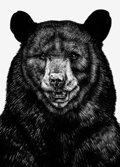
This image shows line as value because the artist used the cross hatching method, using parallel and perpendicular lines to create dark and light areas.

Contour Line


This is an example of contour line because it's a very precise outline. It's concerned with where the woman begins and ends.

Line As Emotion


The orange and yellow lines surrounding the coffee mug convey the emotion of excitement and happiness because of their color and they way they surround it. It could also be because they resemble a sun.

Monday, March 28, 2011

Line Direction


The diagonal lines created by the splattered red liquid strongly suggest motion. In actions, such as running, the body is leaning. Compared to horizontal and vertical lines, diagonal lines are most associated with action.

Sunday, February 13, 2011

Visual Texture


Sidewalk chalk art is a perfect example of visual texture by definition. It's designed to momentarily fool its viewers to think the scene before them is real.

Unity through Continuity


There is a visual relationship between the two individual figures in this print.

Unity with Variety


Although each 'face' is slightly different in color and design, their arrangement and similarity in size and shape give them and obvious underlying feeling of unity.

Unity through Continuation


The woman's arms in this picture help to achieve unity through continuation, in that they creates fluid eye movement from side to side.

Unity through Repetition


I thought this photo showed unity through repetition in a unique way. Unity through repetition is achieved by repeating the mans face within his own mouth.

Unity through Proximity


With the subjects in this photograph being close together, we see them as a group rather than as individual elements.

Tuesday, February 8, 2011

Line As Shape


Line definitely plays a large role in the success of this print. Even with the lack of detail on the bottom half of the tiger's face, it is easily recognizable because of the shape created by line on top.

Wednesday, February 2, 2011

Test


I'm really attracted to simplicity, which is why I chose this print. I think the minimalism of the design itself really compliments the message.


I thought this was appropriate while in the midst of the pattern project. What I like about this print is the color scheme, and its subtle 1950's housewife vibe.